Part of my job is taking what a customer sees in their mind and designing it to meet their needs and, if I’m lucky, make them say “Wow! That’s even better than I had in my head!” Sometimes all I get are some descriptive words of how they need their piece designed, sometimes I get hand-scrawled sketches of a basic layout, but for this project I had a number of physical pieces delivered to work off of.
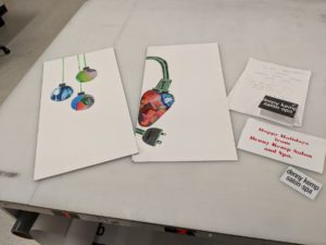
Here is what I was given:
- Two poster boards with cut magazine pieces designed as ornaments and lights
- A gift card holder with company logo
- A gift card with company logo
- Printed paper of desired copy and fonts
My first step was to scan the poster boards. As they were larger than 8.5 x 14, I needed to scan each board four times – from each corner – and then photomerge the resulting photos into one, single, full-size piece. Next, since I was not provided a clean logo, was to scan and clean up the gift card that had the logo/wordmark printed on it before vectorizing it for print. After that came fonts. From their provided copy I could figure out some of their choices, but others I needed to hunt down what fonts they were.
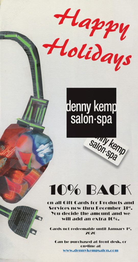
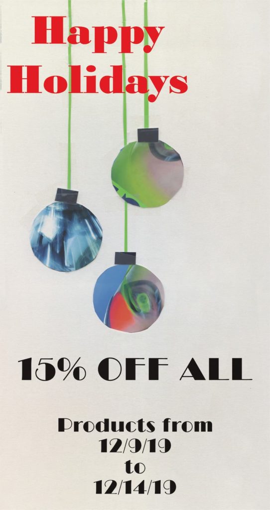
After all that, it was time to bring all the pieces together into one cohesive project that ticked off all the client’s needs for their holiday posters. Putting it all together looked good, but it needed one last touch to make it all feel complete which ended up being adding a sort of fabric texture overlayed to bring it all together.
This one definitely got a “Wow, that’s better than what I had in my head!”


